This chart doesn’t measure friendship, usefulness, or anything like that. It’s showing your flexibility as a communicator.
The chart represents your communication with each individual you’ve recently spoken to (via email or Zoom).
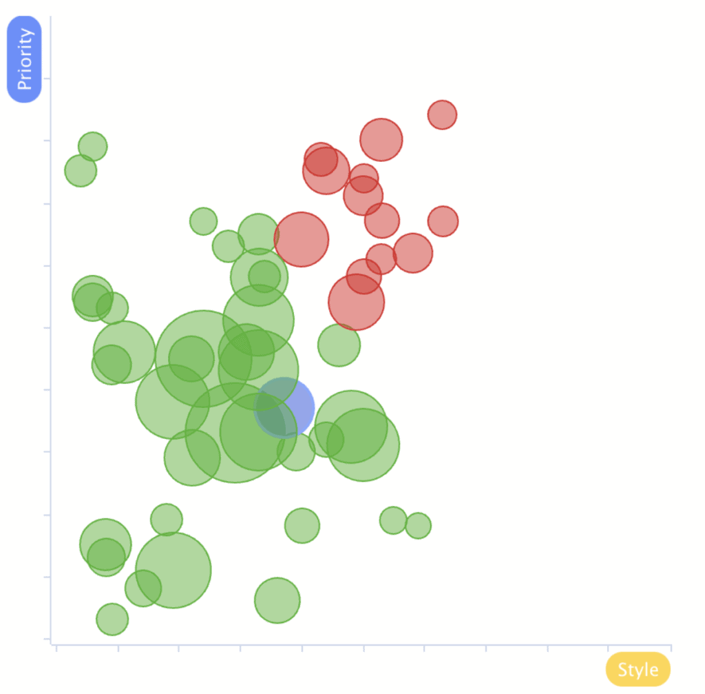
- The larger the circle, the more communication WhatToSay.ai has analyzed between the two of you.
- The closer the circle is to the lower-left corner, the more “aligned” the communication has been with that individual.
So what does alignment mean?
This chart shows how well you can modify your speaking style to match the person you are talking with.
Simply put: The more your Priorities and Style match your audience, the easier it is for them to relate to what you are saying — making you more influential with those people.